
General
Semuc Champey: A Natural Paradise in Guatemala

Nestled deep in the lush Guatemalan jungle lies Semuc Champey, a hidden gem that enchants travelers with its turquoise pools, breathtaking limestone formations, and unparalleled serenity. Known as one of Guatemala’s most stunning natural attractions, Semuc Champey is more than just a destination—it’s an experience of awe-inspiring beauty and adventure. Whether you’re a seasoned traveler or a nature lover, this guide will unveil everything you need to know about visiting Semuc Champey.
What is Semuc Champey?
Semuc Champey is a natural limestone bridge, about 300 meters long, under which the Cahabón River flows. Above this bridge are a series of tiered pools filled with turquoise and emerald-green water, creating a breathtaking sight. The name “Semuc Champey” comes from the Q’eqchi’ Maya language, meaning “where the river hides beneath the earth.”
Where is Semuc Champey Located?
Semuc Champey is located near the town of Lanquín in the Alta Verapaz region of Guatemala. It’s surrounded by dense jungle and rolling hills, making it a secluded paradise for nature enthusiasts.
Why Visit Semuc Champey?
1. Spectacular Natural Beauty
The stunning blue and green pools of Semuc Champey are a visual feast, perfect for photography or simply basking in nature’s splendor.
2. Unique Geological Formation
The limestone bridge and the hidden river below make Semuc Champey a geological wonder.
3. Adventure and Relaxation
Whether you’re hiking, swimming, or just relaxing by the pools, this destination offers a mix of thrills and tranquility.
How to Get to Semuc Champey
1. From Guatemala City
Most visitors start their journey from Guatemala City, taking a bus or shuttle to Cobán, followed by another ride to Lanquín.
2. From Antigua or Flores
Direct shuttles from tourist hubs like Antigua or Flores are available, but the journey can be long and bumpy, often taking 8-10 hours.
3. From Lanquín
The final leg of the journey involves a 45-minute ride in a 4×4 vehicle, as the road to Semuc Champey is rugged and unpaved.
Best Time to Visit Semuc Champey
1. Dry Season (November to April)
The dry season is the best time to visit, with clear skies and warm weather enhancing the pools’ vivid colors.
2. Rainy Season (May to October)
While the rainy season brings lush greenery, the pools can become muddy due to increased river flow, affecting the site’s visual appeal.
Activities at Semuc Champey
1. Swimming in the Pools
Dive into the crystal-clear waters of the pools for a refreshing swim. Each pool has varying depths, so there’s something for everyone.
2. Hiking to El Mirador
For the best views, hike to El Mirador, a viewpoint overlooking the pools and the surrounding jungle. The trail is steep but worth the effort.
3. Exploring the Cahabón River
Witness the powerful flow of the Cahabón River as it disappears beneath the limestone bridge.
4. Tubing
Many visitors enjoy tubing down the Cahabón River, a fun and relaxing way to experience the area.
5. Cave Exploration
Nearby caves, such as the K’anba Caves, offer thrilling adventures with underground rivers, waterfalls, and even candlelit tours.
Wildlife at Semuc Champey
The jungle surrounding Semuc Champey is teeming with wildlife. Keep an eye out for colorful birds, monkeys, and butterflies as you explore the area.
Tips for Visiting Semuc Champey
1. Wear Comfortable Shoes
The trails can be steep and slippery, so sturdy footwear is a must.
2. Bring a Swimsuit and Towel
You’ll definitely want to take a dip in the pools!
3. Pack Light
Carry essentials like water, sunscreen, and snacks, as there are limited facilities on-site.
4. Respect Nature
Help preserve this natural wonder by not leaving trash behind and following park guidelines.
5. Hire a Guide
A local guide can enhance your experience by sharing insights about the area’s history, culture, and geology.
Where to Stay Near Semuc Champey
1. Lanquín
Lanquín offers budget-friendly accommodations, including hostels and eco-lodges. Popular options include El Retiro Lodge and Zephyr Lodge.
2. Near Semuc Champey
Some lodges are located closer to the site, offering convenient access and jungle views.
Cultural Insights
Semuc Champey is located in an area rich in Q’eqchi’ Maya culture. Take time to learn about their traditions, language, and way of life. Many locals work as guides or operate small businesses around the site.
Challenges of Visiting Semuc Champey
1. Accessibility
The journey to Semuc Champey is long and bumpy, especially the final stretch from Lanquín.
2. Limited Amenities
There are few facilities in the area, so be prepared with supplies.
3. Weather
The tropical climate means hot and humid conditions, so stay hydrated and take breaks.
Conclusion
Semuc Champey is a destination like no other, offering a perfect blend of natural beauty, adventure, and cultural richness. Whether you’re swimming in its turquoise pools, hiking to breathtaking viewpoints, or simply soaking in the serenity of the jungle, this Guatemalan treasure promises an unforgettable experience.
FAQs
Is Semuc Champey suitable for families?
Yes, but families should be mindful of the rugged terrain and ensure children are supervised near water.
How much does it cost to visit Semuc Champey?
The entrance fee is approximately $7 USD. Additional costs include transportation, guides, and activities like tubing.
Do I need a guide to visit Semuc Champey?
A guide is not mandatory but highly recommended for first-time visitors to enhance your experience.
How long should I plan to stay in Semuc Champey?
Most visitors spend a full day exploring the pools, hiking, and enjoying the surroundings.
What should I pack for my trip?
Essentials include sturdy shoes, a swimsuit, sunscreen, water, snacks, and a camera to capture the beauty of Semuc Champey.

Is Buying Clothes From Target Just As Bad As Shein?Target and Shein are two of the biggest stores that sell cheap clothes. Both provide contemporary fashions at cheap rates, but when people learn more about the environmental and ethical issues with fast fashion, they start to wonder whether they are equally bad. Or is there a real difference between buying something at Target and purchasing from Shein? Let’s break it down.
Explore Is ASOS Fast Fashion? A Closer Look
Fast Fashion: A Business Model That Everyone Uses
Both Target and Shein follow the fast fashion model, which means they quickly and cheaply manufacture a lot of clothing to keep up with trends that change all the time. But the size and speed are quite different. Shein is recognised for putting out hundreds of new designs every week, and they usually imitate runway styles or hot TikTok trends within a few days. Target releases collections less often, either every season or every month, and occasionally they work with famous designers to do so. Both encourage people to buy too much, but Shein is different since it is so fast.
Working conditions: being open or keeping things secret
One of the most essential things in fashion is how workers are treated. Shein has been accused of unfair labour practices, such as paying workers too little, having them work too many hours, and placing them in risky positions. Target, on the other hand, maintains it exclusively works with suppliers that obey international labour laws. Target has a Supplier Code of Conduct and enables certain outside parties check on its suppliers. People have mentioned terrible things about Shein since it doesn’t tell people how it does business. It has just recently started bringing out ambiguous ESG reports. So, even if neither brand is perfect, Target is generally a bit more responsible.
Effects on the Environment – polyester is everywhere
Both industries utilise a lot of synthetic materials, such polyester, which originate from fossil fuels and make microplastic contamination worse. Shein’s ultra-fast production cycle produces a lot of textile waste since a lot of the clothing are only supposed to be worn a few times. The materials used in Target’s garments aren’t much better for the environment, but the company has promised to be more eco-friendly in public, such by utilising more recycled fabrics and cutting down on emissions. These stages may not be new, but they are at least a starting point, which is something Shein still doesn’t have in a big way.
Greenwashing and ethical Certifications
Target works with groups like Better Cotton and sells a small number of clothes that are OEKO-TEX certified or manufactured from recycled materials. It also puts out a report on sustainability that lists its aims and accomplishments. These changes may not always work as well as they seem, and they may even be examples of “greenwashing,” but they do illustrate that consumers are putting pressure on companies to change. On the other hand, Shein has been slower to put into place or make public any known ethical certifications. The fact that no one else has verified their statements is nevertheless a red signal.
What are you really paying for: Price vs. Quality?
Shein’s very low pricing are a big lure, but they frequently mean that the company has very low manufacturing expenses, which are usually due to bad working conditions and inexpensive supplies. Target’s prices are still reasonable, but the clothes are usually of higher quality, last longer, and fit a little more consistently. Over time, you may not need to replace clothing from Target as often as you need clothes from Shein. This might imply that the cost per wear is much lower, even if the initial purchase is greater.
Responsibility as a Consumer – voting with your money
There is no big store that is completely ethical or sustainable, although some are better than others. You may lower your impact by buying fewer, higher-quality items and picking businesses that are more explicit about their ethical values. Target may not be the best choice, but when you compare it directly to Shein, it is a better one. If you can’t afford or get to ethical fashion labels, buying at Target or thrift shops might be a better option.
The Decision – Not Equal, But There Is Room for Improvement
To address the question, no, purchasing clothing from Target is not as horrible as buying clothes from Shein. Both companies are part of the fast fashion market, but Shein’s extraordinary speed, lack of transparency, and exploitation make it worse. Target is not perfect, but it is at least headed in the right way when it comes to improving working conditions and sustainability. What you need to remember is Every purchase has power. If you want to buy quick fashion, certain stores are better than others. In most circumstances, Target is the better of the two.
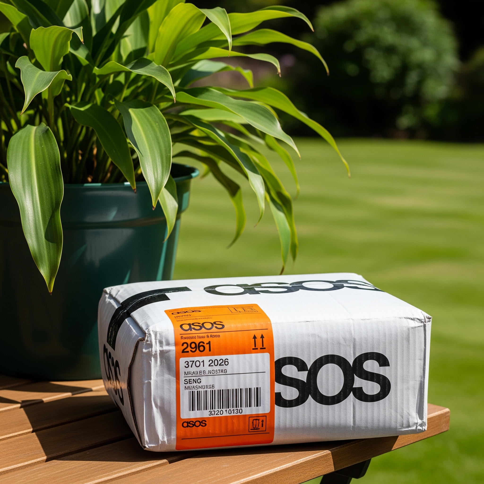
How to Cancel an Order in ASOS? People love how quickly they ship and how many different kinds of clothes they have. But what if you accidentally make an order or change your mind just after you check out? A lot of people who purchase at ASOS question themselves, “How do I cancel an order?” When you ask, the response will depend on your order status and how you pay. This article will guide you through the process of cancelling your ASOS purchase, including what to do if it’s already too late.
Explore Is Asos Returns Free?
How to Cancel Order In Asos?
1. Move quickly: Timing is key
You may be able to cancel your purchase right from your ASOS account if it hasn’t been completed yet. If the status says “Processing”, you may still be able to cancel. The option goes away when it changes to “Picking” or “Shipped”, and you’ll have to go through the return procedure instead.
2. How to cancel your order on ASOS online
Log into your ASOS account and follow these steps to cancel an order:
- Click on “My Orders.”.
- Find the order you wish to cancel.
- If you see the “Cancel Order” button, click it.
- Please confirm your request to cancel.Thereafter, you should get an email confirming your order. If you don’t see the cancel option, it means your purchase has progressed too far for cancellation. If that’s the case, you’ll have to wait for the product to arrive and then start the return process.
3. What if there isn’t a button to cancel?
Don’t worry if you can’t find the cancel option. Once an order is at the warehouse picking stage, ASOS won’t let you cancel it. If this occurs, the best thing to do is deny delivery or use the prepaid return system when the item gets there. Most things from ASOS may be returned within 28 days, so as long as the item is unused and in its original condition, you can still obtain a full refund. Keep in mind that swimsuits and earrings that are personalised or sensitive to cleanliness may not be returned.
4. Would it be possible to cancel an ASOS order via customer service?
Many people want to know whether calling customer support can help them cancel a purchase. ASOS’s customer service staff is helpful; however, they can’t refund purchases that have already been processed. If your order is still eligible, support could let you cancel it online, but they won’t be able to change the system after the box is being packed or dispatched. It’s always quicker and better to cancel through your account, if at all possible.
5. What to Expect When You Get Your Money Back After Cancelling
ASOS usually processes refunds within 3–5 business days of your cancellation, although this depends on how you paid. As soon as the reimbursement goes through, you’ll get an email to let you know. If you used Klarna, Clearpay, or a similar “buy now, pay later” service, the refund can show up as a cancellation of the next payment schedule instead of a regular refund. Always check with your bank or payment service to see what the current status is.
6. Changing Orders Instead of Calling Off
Sadly, ASOS won’t let you change your order once you’ve placed it. This includes changing the item’s size, colour, shipping location, or payment method. If you can still do it, cancel the order and make a new one with the right info. Check your order summary again before clicking “Place Order” to make sure you don’t make any errors in the future, particularly during sales or limited-time deals.
Last words – Be quick and smart
You can cancel an order on ASOS, but only if you respond promptly. The first 30 to 60 minutes after you place your order are the greatest time to get it right. You should always check the progress of your purchase via your ASOS account and be ready to return it if necessary. ASOS’s quick shipping may not give much space for adjustments, but their simple return policy makes up for it. Stay cool, since there’s virtually always a way to remedy anything, correctingr you’re fixing a mistake or changing your mind.
Knowing Why SHEIN Finds Pop-Ups Useful (and Why They Might Be Irritating)
Like many online stores, SHEIN uses pop-ups for many tactical purposes. These usually involve advertising specials and discounts, revealing new arrivals, urging email sign-ups for special deals, and stressing significant site changes or policy modifications. From SHEIN’s point of view, pop-ups are a quick and sometimes efficient method to catch your notice and provide important information or marketing messages. Their goals are to grow their consumer base, boost revenues, and promote involvement.
Explore How Much Is Under Armour Worth?
How To Stop Pop Up In Shein Website? From the user’s perspective, however, regular or bothersome pop-ups may be really annoying. They may cause unintentional clicks on undesired promotions, cloud product views, and slow down website loading times, among other things. Some websites’ pop-up frequency and volume, like maybe SHEIN at peak sale times, might seem excessive and spoil the whole purchasing experience. Finding efficient ways to control these interruptions starts with knowing this dichotomy: SHEIN’s need to communicate and the user’s want for a continuous experience.
The Direct Approach: Shutting Individual SHEIN Pop-Ups
Simply closing a SHEIN pop-up addresses it most directly and obviously. Most pop-ups will feature a clearly indicated “X” symbol, a “Close” button, or a “No, thanks” or similar refuse choice. Although this approach doesn’t stop future pop-ups, it handles the present disturbance.
How To Stop Pop Up In Shein Website?Closing pop-ups calls for caution. Unless you are really interested in the offer, stay away from any pop-up links or buttons. Occasionally, false pop-ups might attempt to get you to click on ads or even harmful URLs masquerading as close buttons. Usually in a corner of the pop-up, the genuine close icon should always be sought. Although this manual approach is straightforward, it could become tiresome if pop-ups show up often throughout your SHEIN surfing session.
Using Browser Settings to Prevent Pop-Ups (General Approach)
Most contemporary online browsers provide built-in pop-up blockers that may assist control or get rid of undesired pop-ups on all sites, including SHEINThough the exact steps vary somewhat depending on your browser—Chrome, Firefox, Safari, Edge, etc., the fundamental concept is to open your browser’s settings or preferences and locate the privacy and security section.
This area should include choices on site permissions or content controls where you may control how websites handle pop-ups and redirection.
How To Stop Pop Up In Shein Website? Usually, you will have choices to let all pop-ups, block all pop-ups, or control pop-ups on a site-by-site basis. Choosing the pop-up blocking option will cause your browser to try to stop most undesired windows from showing as you surf SHEIN and other sites. Remember that some sites use pop-ups for vital activities, hence a rigorous “block all” option might sometimes affect website performance.
Step-by-Step Guides for Well-Liked Browsers (Chrome, Firefox, Safari, Edge)
These are quick tips for accessing pop-up blocking options in some well-known browsers:
Google Chrome
- In the top-right corner, click the three vertical dots (Menu).
- Choose “Settings.”
- On the left sidebar, click “Privacy and security.”
- Select “Site settings.”
- Scroll down to find “Pop-ups and redirects.”
- Set the option to “Blocked (recommended).” If required, you may additionally include certain websites on a “Allowed to send pop-ups” list.
Mozilla FireFox
- In the top-right corner, click the three horizontal lines (Menu).
- Choose “Options.”
- Then On the left sidebar, click “Privacy & Security.”
- Go down and allow Permission from “Permissions” area.
- Select the box under “Block pop-up windows.” To control permitted websites, you may click on “Exceptions…”
Safari (Mac OS)
- Download Safari
- Choose “Preferences.”
- Select the “Websites” tab.
- From the left sidebar, choose “Pop-up Windows.”
- Look for SHEIN in the list (or choose the default for “When visiting other websites”) and select “Block” from the submenu.
Microsoft’s Edge
- In the top-right corner, click the three horizontal dots (Menu).
- Choose “Settings.”
- From the left sidebar, click “Cookies and site permissions.”
- Select “Pop-ups and redirects.”
- Set the option to “Block (recommended).” You may include certain websites on a “Allow” list.
- Changing these browser settings can help you to greatly lower the amount of pop-ups you come across while using the SHEIN site.
Using Third-Party Pop-Up Blockers for Improved Control
For individuals seeking more robust and flexible pop-up blocking capabilities, several third-party browser addons exist Extensions such as Ghostery, uBlock Origin, AdBlock Plus, and AdBlock provide sophisticated filtering choices and may be quickly included into your browser’s extension store.
Once installed, these blockers usually operate automatically in the background to find and remove many kinds of internet advertising, including pop-ups on SHEIN-like sites.
Many of these extensions also provide other privacy protection capabilities like cookie and tracker blocking. Nevertheless, to avoid such security issues, one should choose trustworthy extensions from reputable developers.
Controlling SHEIN’s Own Notification Preferences (If Relevant)
Occasionally, the “pop-ups” you see on SHEIN might be connected to the site’s own notification system requesting permission to provide push alerts via your browser. Though they are not like conventional pop-up windows, they might nevertheless be seen as bothersome.
How To Stop Pop Up In Shein Website?Usually, you’ll see a request in the top-left area of your browser window when SHEIN seeks to send alerts. Should you not want to get these alerts, “Block” or “Don’t Allow” are very important clicks. Managing your browser’s notification settings will be required if you unintentionally permitted notifications and want to turn them off. Usually, this is located in the same site settings or privacy and security section where pop-up filtering is set up. Usually, SHEIN will be on a list of permitted websites; you may cancel its notification-sending authorisation.
Long-Term Plans for a Cleaner SHEIN Browsing Experience
Usually, the most successful long-term approach for reducing pop-up interruptions on SHEIN is to use a mix of the techniques covered above. Your browser’s built-in pop-up blocker should be configured first. Should you continue to see too many pop-ups, think about putting a reliable third-party ad blocker for more forceful filtering in place.
How To Stop Pop Up In Shein Website? Be also aware of the rights you provide websites. When asked to allow notifications, consider before pressing “Allow.” To control permissions for websites you often visit, including SHEIN, regularly check your browser’s site settings. Regularly checking your browser settings and using suitable tools can help you to greatly improve your SHEIN surfing experience and have a more concentrated shopping session with less clutter. Keep in mind that the aim is to strike a balance that lets you get the information you want from SHEIN without being constantly assaulted by undesired distractions.
-

 General2 years ago
Sigma Wolf: The Lone Leader Redefining Strength
-

 General2 years ago
Duolingo Leagues: A Guide to Level Up Your Language Skills
-

 BUSINESS2 years ago
Anthropic Valuation: Measuring Human Impact and Value
-

 General2 years ago
Unveiling Misav: All You Need to Know About This Game-Changer
-
 TECHNOLOGY2 years ago
Skybox Camera: The Ultimate Tool for Capturing 360-Degree Views
-
 TECHNOLOGY2 years ago
Unveiling Lacey Maurer NC: Everything You Need to Know
-

 Health & Fitness2 years ago
Grated Cheese: The Unsung Hero of Culinary Creations
-

 BUSINESS2 years ago
5starsstocks.com Nickel: Your Comprehensive Investment Guide